Find more at my design leadership portfolio
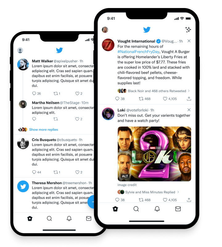
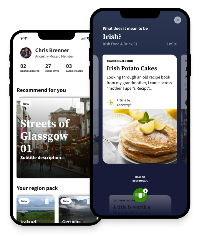
Over 15 years of experience designing for all platforms, leading teams, directing design & marketing/growth, and managing all types of designers. Below is some example work, as a lot of my past work is covered by NDAs. Projects are a mix of individual contribution and leadership/direction. Our goal with Make Twiter Easy was to tackle the known usability problems that were core to the Twitter experience. This included things like where the Reply button on a Tweet would take users; does it allow a user to reply or does it allow users to view the replies to the tweet? True is a private-by-default social app. It featured small groups of friends and family in Threads and allowed complete control of your own information, without harvesting your data. Mosaic was a new and exploratory product I directed and designed while at Ancestry. Mosaic helped people to discover the culture and traditions behind their DNA Story results. Traits was a premium add-on product to the Ancestry DNA core product and experience. Traits allowed people to understand more about themselves, their bodies, and how they inherited physical, sensory, and emotional traits.
Design Work by John Wayne Hill
Make Twitter Easy
View Details
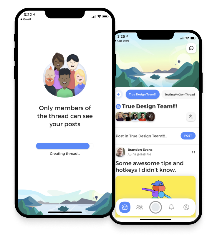
True App
View Details
Ancestry Mosaic
View Details
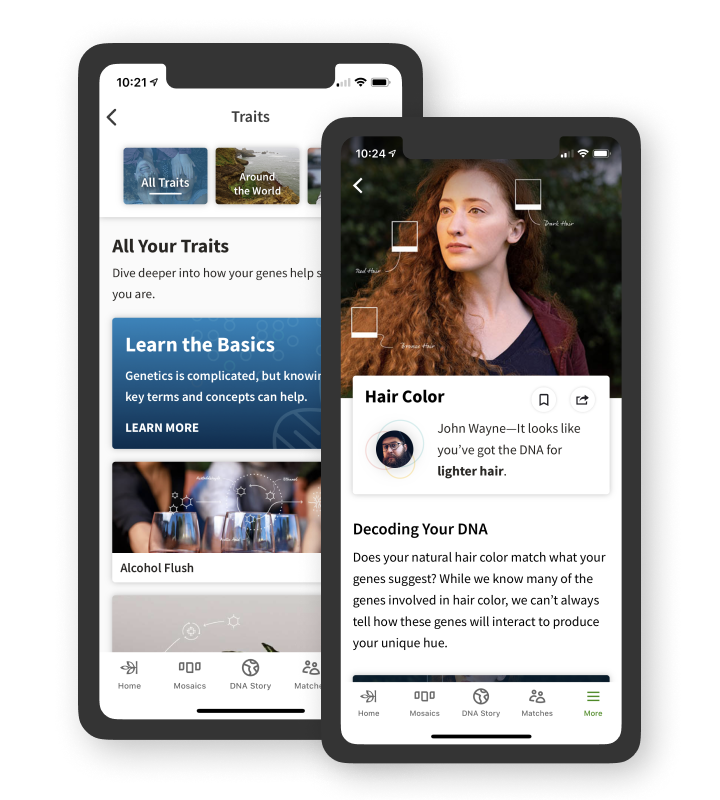
Traits
View Details
Individual design work from 2009-2015. For updated design and leadership work, please see my design leadership portfolio.